 This card layout came from page 97 of the Fall/Winter Collection Catalog. The color combo is Always Artichoke, Rose Red and So Saffron.
To create the main image I chose to use the set True Friend and to ink up the larger flower with markers, excluding the leaf on the right and stamped it at an angle, centering the stem and putting the flower in the upper right corner. I then inked up the smaller flower image with markers and stamped it so the stem touched the stem from the first image. The saying was stamped in Rose Red and after it had a few minutes to dry I colored it in with a So Saffron marker making sure to not bleed the colors together. The So Saffron layer was cut ½" wider than the main image and I folded this extra over and stamped the stitching in Always Artichoke with the All in a Row set. The ribbon is White Taffeta ~ I love this ribbon. It is so easy to tie it into a simple knot and have it look perfect. To finish off the card I added a yellow Circle Rhinestone Brad.
This card layout came from page 97 of the Fall/Winter Collection Catalog. The color combo is Always Artichoke, Rose Red and So Saffron.
To create the main image I chose to use the set True Friend and to ink up the larger flower with markers, excluding the leaf on the right and stamped it at an angle, centering the stem and putting the flower in the upper right corner. I then inked up the smaller flower image with markers and stamped it so the stem touched the stem from the first image. The saying was stamped in Rose Red and after it had a few minutes to dry I colored it in with a So Saffron marker making sure to not bleed the colors together. The So Saffron layer was cut ½" wider than the main image and I folded this extra over and stamped the stitching in Always Artichoke with the All in a Row set. The ribbon is White Taffeta ~ I love this ribbon. It is so easy to tie it into a simple knot and have it look perfect. To finish off the card I added a yellow Circle Rhinestone Brad.

Showing posts with label cards. Show all posts
Showing posts with label cards. Show all posts
10/04/2007
Layout Inspiration from the Fall/Winter Catalog
This card layout came from page 97 of the Fall/Winter Collection Catalog. The color combo is Always Artichoke, Rose Red and So Saffron.
To create the main image I chose to use the set True Friend and to ink up the larger flower with markers, excluding the leaf on the right and stamped it at an angle, centering the stem and putting the flower in the upper right corner. I then inked up the smaller flower image with markers and stamped it so the stem touched the stem from the first image. The saying was stamped in Rose Red and after it had a few minutes to dry I colored it in with a So Saffron marker making sure to not bleed the colors together. The So Saffron layer was cut ½" wider than the main image and I folded this extra over and stamped the stitching in Always Artichoke with the All in a Row set. The ribbon is White Taffeta ~ I love this ribbon. It is so easy to tie it into a simple knot and have it look perfect. To finish off the card I added a yellow Circle Rhinestone Brad.


10/03/2007
Fabulous Flowers Card for SUDSOL swap
 When I saw this stamp set, Fabulous Flowers, I knew that it would be part of my first order from the new catalog but when it finally arrived I just went blank. The large flower was overwhelming on the first few cards that I came up with but when I paired it with the new In Colors I loved it.
The base of the card is River Rock with a 1" x 5½" strip of Groovy Guava. Both of these layers were stamped tone on tone with the smallest two flower images from the set.
The main image is a 2½" x 3¾" piece of whisper white that has the flower images stamped with Groovy Guava, Purely Pomegranate, River Rock and Wild Wasabi. There was too much blank space for me so I used Itty Bitty Backgrounds with Groovy Guava and River Rock to fill it in a bit. I then layered this with Purely Pomegranate.
I have an insane need to put ribbon on all of my projects. They just don't look finished to me without it and this card was no exception. I could have just wrapped the Wild Wasabi Double Stitched Ribbon around the image and tied it but wanted something a bit different. I used the Horizontal Slot Punch so I could thread the ribbon through the main image which I attached to the front of the card with dimensionals.
Last but not least I stamped the Dare to be Fabulous saying with Purely Pomegranate.
I used this card for the COTM Swap for September on SUDSOL (Simply Unique Demonstrators Sharing OnLine). You sign up for 1, 2 or 3 partners and then swap cards with them.
When I saw this stamp set, Fabulous Flowers, I knew that it would be part of my first order from the new catalog but when it finally arrived I just went blank. The large flower was overwhelming on the first few cards that I came up with but when I paired it with the new In Colors I loved it.
The base of the card is River Rock with a 1" x 5½" strip of Groovy Guava. Both of these layers were stamped tone on tone with the smallest two flower images from the set.
The main image is a 2½" x 3¾" piece of whisper white that has the flower images stamped with Groovy Guava, Purely Pomegranate, River Rock and Wild Wasabi. There was too much blank space for me so I used Itty Bitty Backgrounds with Groovy Guava and River Rock to fill it in a bit. I then layered this with Purely Pomegranate.
I have an insane need to put ribbon on all of my projects. They just don't look finished to me without it and this card was no exception. I could have just wrapped the Wild Wasabi Double Stitched Ribbon around the image and tied it but wanted something a bit different. I used the Horizontal Slot Punch so I could thread the ribbon through the main image which I attached to the front of the card with dimensionals.
Last but not least I stamped the Dare to be Fabulous saying with Purely Pomegranate.
I used this card for the COTM Swap for September on SUDSOL (Simply Unique Demonstrators Sharing OnLine). You sign up for 1, 2 or 3 partners and then swap cards with them.
5/24/2007
April Stamp Club
 I had my monthly Stamp Club Card Class this past Friday and these are the cards that we made. I wanted to use all retiring sets so that they would see what they would be missing come July 1st.
For the Roses in Winter card we used the Rock 'n Roll Technique. I inked the largest image up with Apricot Appeal and then rolled the edges in Rose Red and then stamped. I repeated this with the middle image and then for the top one I inked it up with Rose Red and then stamped off. I love how these colors look together. The leaves are stamped with Green Galore, the larger image stamped off first and then the smaller image stamped over it. The small flowers are inked with Tempting Turquoise and then stamped off - full strength was just too much for me. It still looked a little bright so I used the speckled stamp from Itty Bitty Backgrounds and stamped randomly with Apricot Appeal and Rose Red. You can't tell from the photo but the top layer is Shimmery White. I used the Ticket Corner Punch on the main image, then layered it on Rose Red and place a Tempting Turquoise brad in each corner. When I first finished the card the Tempting Turquoise layer was plain with no Faux Stitching on it but it looked way too plain. Because the card was already put together I couldn't pierce the holes so I used my Basic Black marker, drew each dot on then and then created the stitches with my white gel pen. The base of the card measured 8½" x 5½" folded in half and is Apricot Appeal with the large rose image stamped with Apricot Appeal.
I had my monthly Stamp Club Card Class this past Friday and these are the cards that we made. I wanted to use all retiring sets so that they would see what they would be missing come July 1st.
For the Roses in Winter card we used the Rock 'n Roll Technique. I inked the largest image up with Apricot Appeal and then rolled the edges in Rose Red and then stamped. I repeated this with the middle image and then for the top one I inked it up with Rose Red and then stamped off. I love how these colors look together. The leaves are stamped with Green Galore, the larger image stamped off first and then the smaller image stamped over it. The small flowers are inked with Tempting Turquoise and then stamped off - full strength was just too much for me. It still looked a little bright so I used the speckled stamp from Itty Bitty Backgrounds and stamped randomly with Apricot Appeal and Rose Red. You can't tell from the photo but the top layer is Shimmery White. I used the Ticket Corner Punch on the main image, then layered it on Rose Red and place a Tempting Turquoise brad in each corner. When I first finished the card the Tempting Turquoise layer was plain with no Faux Stitching on it but it looked way too plain. Because the card was already put together I couldn't pierce the holes so I used my Basic Black marker, drew each dot on then and then created the stitches with my white gel pen. The base of the card measured 8½" x 5½" folded in half and is Apricot Appeal with the large rose image stamped with Apricot Appeal.
 With Father's Day right around the corner I knew that one of the cards needed to be masculine and as this is the only non-retired, manly set I own the decision was made for me. I really like this set and am disappointed that it is retiring. I used Sahara Sand for the base card and the top layer. The base measures 11" x 4¼" and is folded in half and then stamped with the Canvas background stamp in Sahara Sand. The next layer is Buckaroo Blue with black grosgrain ribbon and black eyelets as accessories. I stamped the main image with Jet Black StazOn and then colored it with my aquapainter. I used Sahara Sand to create a subtle shadow under the truck and on the windshield, the wheels, the bumper and the grill. I colored the rest of the truck with Buckaroo Blue and then over the top I colored the flames with Marigold Morning. I distressed the top two layers with the cutter tool and stamped the saying with the black StazOn.

 For the third card I wanted to create one with a unique fold so I started with a base of Cranberry Crisp and scored in from each end to 2 1/8". Fold these in and this is the card front. I then stamped the card front with the Paisley background stamp in Cranberry Crisp, adhered a piece of white grosgrain around the entire card and then embossed the saying in Winter White EP. The main image is stamped on Shimmery White using Vintage Violet, Cranberry Crisp, Marigold Morning and True Thyme. The vase image was stamped using the "Kissing" Technique. To create it I first inked up the Paisley background stamp with vintage violet and then inked the vase stamp with Cranberry Crisp. To have a greater contrast from the two colors I first stamped off the vase image once and then "kissed" the Paisley with it. This put the paisley design onto the vase stamp in the violet ink. I then stamped the vase onto the Shimmery White. After stamping the stems and flowers I layered the main image onto Cranberry Crisp and then onto Marigold Morning.
Thanks for looking and have a wonderful day!
For the third card I wanted to create one with a unique fold so I started with a base of Cranberry Crisp and scored in from each end to 2 1/8". Fold these in and this is the card front. I then stamped the card front with the Paisley background stamp in Cranberry Crisp, adhered a piece of white grosgrain around the entire card and then embossed the saying in Winter White EP. The main image is stamped on Shimmery White using Vintage Violet, Cranberry Crisp, Marigold Morning and True Thyme. The vase image was stamped using the "Kissing" Technique. To create it I first inked up the Paisley background stamp with vintage violet and then inked the vase stamp with Cranberry Crisp. To have a greater contrast from the two colors I first stamped off the vase image once and then "kissed" the Paisley with it. This put the paisley design onto the vase stamp in the violet ink. I then stamped the vase onto the Shimmery White. After stamping the stems and flowers I layered the main image onto Cranberry Crisp and then onto Marigold Morning.
Thanks for looking and have a wonderful day!
3/19/2007
Chocolate Chip Teddy Bear
Today's Technique Challenge was to use only browns and vanilla to create a card. I knew that I was going to use this teddy bear from the new Bundle of Joy stamp set and when I sat down this card just came together first try! Got to love it when that happens.
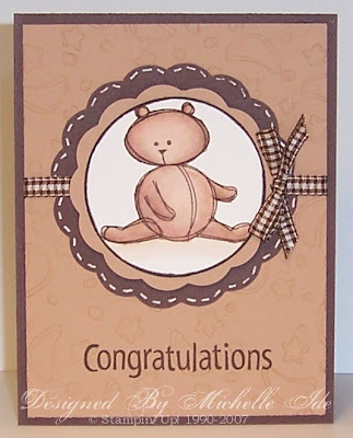 All Supplies Stampin' Up!® Paper : Chocolate Chip, Creamy Caramel, Very Vanilla Stamps : Bundle of Joy, All Year Cheer I Inks : Timber Brown StazOn™, Chocolate Chip, Creamy Caramel, Close to Cocoa Accessories : Aquapainter, non SU! Ribbon, Corner Rounder, Creamy Caramel Marker, Coluzzle, White Gel Pen, Dimensionals, Stamp-a-ma-jig
To get the dark ring around the vanilla layer I took the image and rolled the edge on the Chocolate Chip ink pad. When I got this all done it looked a little plain so I used the white gel pen to create the faux stitching and when it was dry I colored over it with the Creamy Caramel marker.
All Supplies Stampin' Up!® Paper : Chocolate Chip, Creamy Caramel, Very Vanilla Stamps : Bundle of Joy, All Year Cheer I Inks : Timber Brown StazOn™, Chocolate Chip, Creamy Caramel, Close to Cocoa Accessories : Aquapainter, non SU! Ribbon, Corner Rounder, Creamy Caramel Marker, Coluzzle, White Gel Pen, Dimensionals, Stamp-a-ma-jig
To get the dark ring around the vanilla layer I took the image and rolled the edge on the Chocolate Chip ink pad. When I got this all done it looked a little plain so I used the white gel pen to create the faux stitching and when it was dry I colored over it with the Creamy Caramel marker.

 All Supplies Stampin' Up!® Paper : Chocolate Chip, Creamy Caramel, Very Vanilla Stamps : Bundle of Joy, All Year Cheer I Inks : Timber Brown StazOn™, Chocolate Chip, Creamy Caramel, Close to Cocoa Accessories : Aquapainter, non SU! Ribbon, Corner Rounder, Creamy Caramel Marker, Coluzzle, White Gel Pen, Dimensionals, Stamp-a-ma-jig
To get the dark ring around the vanilla layer I took the image and rolled the edge on the Chocolate Chip ink pad. When I got this all done it looked a little plain so I used the white gel pen to create the faux stitching and when it was dry I colored over it with the Creamy Caramel marker.
All Supplies Stampin' Up!® Paper : Chocolate Chip, Creamy Caramel, Very Vanilla Stamps : Bundle of Joy, All Year Cheer I Inks : Timber Brown StazOn™, Chocolate Chip, Creamy Caramel, Close to Cocoa Accessories : Aquapainter, non SU! Ribbon, Corner Rounder, Creamy Caramel Marker, Coluzzle, White Gel Pen, Dimensionals, Stamp-a-ma-jig
To get the dark ring around the vanilla layer I took the image and rolled the edge on the Chocolate Chip ink pad. When I got this all done it looked a little plain so I used the white gel pen to create the faux stitching and when it was dry I colored over it with the Creamy Caramel marker.
3/16/2007
March Stamp Club Class
This months Stamp Club Class is tonight so I've been designing cards today for it. I know that I shouldn't wait until the last minute but I just seem to work best under pressure. I've come up with 10 or so cards this past week but I wasn't happy with any of them so bright and early this morning I headed down and came up with these three.
 All Supplies Stampin' Up!® Paper : Tempting Turquoise, Glossy White, Old Olive, Petals & Paisleys DP and So Saffron Stamps : Polka Dots & Paisley Inks : Black StazOn™, Tempting Turquoise, Regal Rose, So Saffron Accessories : Aquapainter, Stamp-a-ma-jig, Black Journal Marker, Tempting Turquoise Marker, Rose Red Marker, Turquoise Grosgrain Ribbon, Corner Rounder
I really like this one except for the "happy" tag. This is the first time that I've used a sentiment tab on a card and I'm just not sure about it. The flowers are water colored on Glossy card stock. I saw on the Occasional Stamper where Kim uses it to water color on all the time and just had to try it. I really like the results - the paper doesn't absorb the ink too quickly and it allows you to add more for shading without the paper tearing.
All Supplies Stampin' Up!® Paper : Tempting Turquoise, Glossy White, Old Olive, Petals & Paisleys DP and So Saffron Stamps : Polka Dots & Paisley Inks : Black StazOn™, Tempting Turquoise, Regal Rose, So Saffron Accessories : Aquapainter, Stamp-a-ma-jig, Black Journal Marker, Tempting Turquoise Marker, Rose Red Marker, Turquoise Grosgrain Ribbon, Corner Rounder
I really like this one except for the "happy" tag. This is the first time that I've used a sentiment tab on a card and I'm just not sure about it. The flowers are water colored on Glossy card stock. I saw on the Occasional Stamper where Kim uses it to water color on all the time and just had to try it. I really like the results - the paper doesn't absorb the ink too quickly and it allows you to add more for shading without the paper tearing.
 All Supplies Stampin' Up!® Paper : Buckaroo Blue, Ruby Red, Mellow Moss, Sahara Sand and Confetti White Stamps : You Make Me Happy, It's Your Birthday (inside) Inks : Buckaroo Blue, Ruby Red, Mellow Moss, Sahara Sand Accessories : Dimensionals, Ticket Corner Punch, Large Oval Punch, Paper Snips, White Gel Pen, Stamp-a-ma-jig
This is definitely my least favorite of the three. I wanted to use the colors from the cover of the March Stamper's Showcase but I didn't have enough of the Ruby Red to make is the main color so instead of giving up and starting over with new colors this is what I came up with. Hopefully they like it.
All Supplies Stampin' Up!® Paper : Buckaroo Blue, Ruby Red, Mellow Moss, Sahara Sand and Confetti White Stamps : You Make Me Happy, It's Your Birthday (inside) Inks : Buckaroo Blue, Ruby Red, Mellow Moss, Sahara Sand Accessories : Dimensionals, Ticket Corner Punch, Large Oval Punch, Paper Snips, White Gel Pen, Stamp-a-ma-jig
This is definitely my least favorite of the three. I wanted to use the colors from the cover of the March Stamper's Showcase but I didn't have enough of the Ruby Red to make is the main color so instead of giving up and starting over with new colors this is what I came up with. Hopefully they like it.
 All Supplies Stampin' Up!® Paper : Close to Cocoa, Barely Banana, Confetti White Stamps : Bundle of Joy, Warmest Regards Inks : Timber Brown StazOn™, So Saffron, Close to Cocoa Accessories : Aquapainter, Taupe Grosgrain Ribbon, Corner Rounder, Watercolor Crayons (Close to Cocoa and Barely Banana), Horizontal Slot Punch, White Gel Pen, Dimensionals, Stamp-a-ma-jig, Gold Brads
 All Supplies Stampin' Up!® Paper : Tempting Turquoise, Glossy White, Old Olive, Petals & Paisleys DP and So Saffron Stamps : Polka Dots & Paisley Inks : Black StazOn™, Tempting Turquoise, Regal Rose, So Saffron Accessories : Aquapainter, Stamp-a-ma-jig, Black Journal Marker, Tempting Turquoise Marker, Rose Red Marker, Turquoise Grosgrain Ribbon, Corner Rounder
 All Supplies Stampin' Up!® Paper : Buckaroo Blue, Ruby Red, Mellow Moss, Sahara Sand and Confetti White Stamps : You Make Me Happy, It's Your Birthday (inside) Inks : Buckaroo Blue, Ruby Red, Mellow Moss, Sahara Sand Accessories : Dimensionals, Ticket Corner Punch, Large Oval Punch, Paper Snips, White Gel Pen, Stamp-a-ma-jig
 All Supplies Stampin' Up!® Paper : Close to Cocoa, Barely Banana, Confetti White Stamps : Bundle of Joy, Warmest Regards Inks : Timber Brown StazOn™, So Saffron, Close to Cocoa Accessories : Aquapainter, Taupe Grosgrain Ribbon, Corner Rounder, Watercolor Crayons (Close to Cocoa and Barely Banana), Horizontal Slot Punch, White Gel Pen, Dimensionals, Stamp-a-ma-jig, Gold Brads
This is my most favorite. When I first saw this set in the Spring Mini I knew that it would be mine. My favorite stamping technique is water coloring and this is perfect for it. It was lacking a little something when I was done so I added the little bits of ribbon and the gold brad. I will be making more of this one.
3/09/2007
How many challenges are too many for one card?
 This card combines three of the weekly challenges from Splitcoast: TLC106 (frayed ribbon), CC104 (So Saffron, Regal Rose, Certainly Celery and Chocolate Chip) and SC114 (the sketch challenge).
The hardest part was using the frayed ribbon. To do this you have to take a length of ribbon and trim off one of the edges and then pull the threads out of the middle. We were supposed to use the threads but after a few attempts of using them my stamp table was covered with ribbon fluff that's from 1/2" to 3" long and it was stuck to everything. So, I ended up using the piece of ribbon that was left over from the fraying process. It is wrapped around the image like a frame.
I stamped one of the flowers on the square piece and then cut another one out and attached it with a dimensional. I then attached the center piece with another dimensional so the flower is very 3-D. I wish that I had make the celery piece narrower but overall I like what I came up with.
This card combines three of the weekly challenges from Splitcoast: TLC106 (frayed ribbon), CC104 (So Saffron, Regal Rose, Certainly Celery and Chocolate Chip) and SC114 (the sketch challenge).
The hardest part was using the frayed ribbon. To do this you have to take a length of ribbon and trim off one of the edges and then pull the threads out of the middle. We were supposed to use the threads but after a few attempts of using them my stamp table was covered with ribbon fluff that's from 1/2" to 3" long and it was stuck to everything. So, I ended up using the piece of ribbon that was left over from the fraying process. It is wrapped around the image like a frame.
I stamped one of the flowers on the square piece and then cut another one out and attached it with a dimensional. I then attached the center piece with another dimensional so the flower is very 3-D. I wish that I had make the celery piece narrower but overall I like what I came up with.
12/20/2006
How many Christmas Cards did you send this year?
My list of people that I send cards to is out of control!! When my husband and I were celebrating our first Christmas together I couldn't wait to send cards to everyone - and I do mean everyone!! As the years have gone by my list has gotten shorter but it is still out of control at over 100 people (107 to be exact) and I only send cards to close friends and family. Just the stamps alone are over $40 and the supplies . . . we won't go there.
 So, when I was filling out my cards I found that I was about 15 cards short so I came up with this simple card and it is probably my favorite this year.
The Snowflakes are embossed with Winter White EP on Glossy White paper. I used Brilliant Blue ink with the polished stone technique** to create the background. The base card is Bashful Blue and the 2nd layer is Brilliant Blue. It's very pretty IRL.
** To do the polished stone technique you wet a cotton ball with rubbing alcohol and then using the reinkers place a few drops of ink on it also. Then you just dab around the paper (you must used the glossy paper for this technique) until you are happy with it. Here's a full tutorial by Beate on SCS => Polished Stone Tutorial <=.
Have a wonderful day!
So, when I was filling out my cards I found that I was about 15 cards short so I came up with this simple card and it is probably my favorite this year.
The Snowflakes are embossed with Winter White EP on Glossy White paper. I used Brilliant Blue ink with the polished stone technique** to create the background. The base card is Bashful Blue and the 2nd layer is Brilliant Blue. It's very pretty IRL.
** To do the polished stone technique you wet a cotton ball with rubbing alcohol and then using the reinkers place a few drops of ink on it also. Then you just dab around the paper (you must used the glossy paper for this technique) until you are happy with it. Here's a full tutorial by Beate on SCS => Polished Stone Tutorial <=.
Have a wonderful day!
 So, when I was filling out my cards I found that I was about 15 cards short so I came up with this simple card and it is probably my favorite this year.
The Snowflakes are embossed with Winter White EP on Glossy White paper. I used Brilliant Blue ink with the polished stone technique** to create the background. The base card is Bashful Blue and the 2nd layer is Brilliant Blue. It's very pretty IRL.
** To do the polished stone technique you wet a cotton ball with rubbing alcohol and then using the reinkers place a few drops of ink on it also. Then you just dab around the paper (you must used the glossy paper for this technique) until you are happy with it. Here's a full tutorial by Beate on SCS => Polished Stone Tutorial <=.
Have a wonderful day!
So, when I was filling out my cards I found that I was about 15 cards short so I came up with this simple card and it is probably my favorite this year.
The Snowflakes are embossed with Winter White EP on Glossy White paper. I used Brilliant Blue ink with the polished stone technique** to create the background. The base card is Bashful Blue and the 2nd layer is Brilliant Blue. It's very pretty IRL.
** To do the polished stone technique you wet a cotton ball with rubbing alcohol and then using the reinkers place a few drops of ink on it also. Then you just dab around the paper (you must used the glossy paper for this technique) until you are happy with it. Here's a full tutorial by Beate on SCS => Polished Stone Tutorial <=.
Have a wonderful day!
12/04/2006
November Christmas Card Class
Finally I'm able to insert the scans of November's Christmas Cards. I've been so busy that wasn't even able to create these until the morning of my class. All of the girls seemed to like them so I'm happy.
 I have one stamper that loves, loves, loves this set and asks that I create a card with it for each of the monthly CC classes. lol
I'm not sure that I like the way I attached the ribbon or where I attached it. After it was done and was looking at it I wanted to move it to the top of the card and move the stamped images down towards the bottom.
I used Bashful Blue and Whisper White card stock; Basic Black and Bashful Blue Ink; and Certainly Celery, Pale Plum, Perfect Plum, Lavender Lace, Apricot Appeal, Close to Cocoa and Bashful Blue markers.
The first image stamped was the snowmen and then we masked them to stamp the trees. Then masked the snowmen and the trees to stamp the snowflakes on the background.
I have one stamper that loves, loves, loves this set and asks that I create a card with it for each of the monthly CC classes. lol
I'm not sure that I like the way I attached the ribbon or where I attached it. After it was done and was looking at it I wanted to move it to the top of the card and move the stamped images down towards the bottom.
I used Bashful Blue and Whisper White card stock; Basic Black and Bashful Blue Ink; and Certainly Celery, Pale Plum, Perfect Plum, Lavender Lace, Apricot Appeal, Close to Cocoa and Bashful Blue markers.
The first image stamped was the snowmen and then we masked them to stamp the trees. Then masked the snowmen and the trees to stamp the snowflakes on the background.
 I have older nieces and nephews who only want money for Christmas so I usually buy this size card at walmart for 99¢ each. I hate to buy any type of card so I decided to try and make one - this is what I came up with.
The card is 8½" x 6½". Then, holding the card the long way in front of you, score it at 3" from one end and 2½" inches from the other end so you have a 3" section, then a 3" section and then a 2½" section. I then folded the 2½" section into the middle of the card and attached it only on one end (easier to slide the money in and out).
It's hard to tell from the picture but the card is Handsome Hunter and I stamped the front of it with Encore silver and Handsome Hunter. To create the custom tag I used my HH marker and colored the outline and the "Make Merry" from the Tag So Much hostess set. I then stamped a small snowflake in place of the image.
I have older nieces and nephews who only want money for Christmas so I usually buy this size card at walmart for 99¢ each. I hate to buy any type of card so I decided to try and make one - this is what I came up with.
The card is 8½" x 6½". Then, holding the card the long way in front of you, score it at 3" from one end and 2½" inches from the other end so you have a 3" section, then a 3" section and then a 2½" section. I then folded the 2½" section into the middle of the card and attached it only on one end (easier to slide the money in and out).
It's hard to tell from the picture but the card is Handsome Hunter and I stamped the front of it with Encore silver and Handsome Hunter. To create the custom tag I used my HH marker and colored the outline and the "Make Merry" from the Tag So Much hostess set. I then stamped a small snowflake in place of the image.
 I saw a card on Splitcoast that used Very Vanilla, Whisper White and Creamy Caramel and really liked it but when I tried to create one with these colors I decided against the Caramel and used Gold Embossing Powder instead. The main card didn't scan so well but it really turned out nice.
For the edges of the two smaller layers I used the distressing tool on the new Cutter Kit.
Embossing is always such a WOW project and one of my stampers, who is new to stamping, was cracking the rest of us up as she was heating her images. She was totally into it and would start to squeal when the EP started to turn. It was too funny!!
I saw a card on Splitcoast that used Very Vanilla, Whisper White and Creamy Caramel and really liked it but when I tried to create one with these colors I decided against the Caramel and used Gold Embossing Powder instead. The main card didn't scan so well but it really turned out nice.
For the edges of the two smaller layers I used the distressing tool on the new Cutter Kit.
Embossing is always such a WOW project and one of my stampers, who is new to stamping, was cracking the rest of us up as she was heating her images. She was totally into it and would start to squeal when the EP started to turn. It was too funny!!
 Here is the final card. These aren't the colors that I had originally wanted to use but when I went to cut it for the class I didn't have enough so I had to change them. I like this combo so much better.
Have a wonderful day!!!
Here is the final card. These aren't the colors that I had originally wanted to use but when I went to cut it for the class I didn't have enough so I had to change them. I like this combo so much better.
Have a wonderful day!!!
 I have one stamper that loves, loves, loves this set and asks that I create a card with it for each of the monthly CC classes. lol
I'm not sure that I like the way I attached the ribbon or where I attached it. After it was done and was looking at it I wanted to move it to the top of the card and move the stamped images down towards the bottom.
I used Bashful Blue and Whisper White card stock; Basic Black and Bashful Blue Ink; and Certainly Celery, Pale Plum, Perfect Plum, Lavender Lace, Apricot Appeal, Close to Cocoa and Bashful Blue markers.
The first image stamped was the snowmen and then we masked them to stamp the trees. Then masked the snowmen and the trees to stamp the snowflakes on the background.
I have one stamper that loves, loves, loves this set and asks that I create a card with it for each of the monthly CC classes. lol
I'm not sure that I like the way I attached the ribbon or where I attached it. After it was done and was looking at it I wanted to move it to the top of the card and move the stamped images down towards the bottom.
I used Bashful Blue and Whisper White card stock; Basic Black and Bashful Blue Ink; and Certainly Celery, Pale Plum, Perfect Plum, Lavender Lace, Apricot Appeal, Close to Cocoa and Bashful Blue markers.
The first image stamped was the snowmen and then we masked them to stamp the trees. Then masked the snowmen and the trees to stamp the snowflakes on the background.
 I have older nieces and nephews who only want money for Christmas so I usually buy this size card at walmart for 99¢ each. I hate to buy any type of card so I decided to try and make one - this is what I came up with.
The card is 8½" x 6½". Then, holding the card the long way in front of you, score it at 3" from one end and 2½" inches from the other end so you have a 3" section, then a 3" section and then a 2½" section. I then folded the 2½" section into the middle of the card and attached it only on one end (easier to slide the money in and out).
It's hard to tell from the picture but the card is Handsome Hunter and I stamped the front of it with Encore silver and Handsome Hunter. To create the custom tag I used my HH marker and colored the outline and the "Make Merry" from the Tag So Much hostess set. I then stamped a small snowflake in place of the image.
I have older nieces and nephews who only want money for Christmas so I usually buy this size card at walmart for 99¢ each. I hate to buy any type of card so I decided to try and make one - this is what I came up with.
The card is 8½" x 6½". Then, holding the card the long way in front of you, score it at 3" from one end and 2½" inches from the other end so you have a 3" section, then a 3" section and then a 2½" section. I then folded the 2½" section into the middle of the card and attached it only on one end (easier to slide the money in and out).
It's hard to tell from the picture but the card is Handsome Hunter and I stamped the front of it with Encore silver and Handsome Hunter. To create the custom tag I used my HH marker and colored the outline and the "Make Merry" from the Tag So Much hostess set. I then stamped a small snowflake in place of the image.
 I saw a card on Splitcoast that used Very Vanilla, Whisper White and Creamy Caramel and really liked it but when I tried to create one with these colors I decided against the Caramel and used Gold Embossing Powder instead. The main card didn't scan so well but it really turned out nice.
For the edges of the two smaller layers I used the distressing tool on the new Cutter Kit.
Embossing is always such a WOW project and one of my stampers, who is new to stamping, was cracking the rest of us up as she was heating her images. She was totally into it and would start to squeal when the EP started to turn. It was too funny!!
I saw a card on Splitcoast that used Very Vanilla, Whisper White and Creamy Caramel and really liked it but when I tried to create one with these colors I decided against the Caramel and used Gold Embossing Powder instead. The main card didn't scan so well but it really turned out nice.
For the edges of the two smaller layers I used the distressing tool on the new Cutter Kit.
Embossing is always such a WOW project and one of my stampers, who is new to stamping, was cracking the rest of us up as she was heating her images. She was totally into it and would start to squeal when the EP started to turn. It was too funny!!
 Here is the final card. These aren't the colors that I had originally wanted to use but when I went to cut it for the class I didn't have enough so I had to change them. I like this combo so much better.
Have a wonderful day!!!
Here is the final card. These aren't the colors that I had originally wanted to use but when I went to cut it for the class I didn't have enough so I had to change them. I like this combo so much better.
Have a wonderful day!!!
10/17/2006
 I created this card using colors from this weeks Color Combo Challenge on Splitcoast. I never would have used them together but I really like it. The colors are Blush Blossom, Certainly Celery and Tempting Turquoise.
You cannot see it in the scan but I also painted the image with Lumiere so it has a subtle shimmer IRL.
This is going for the October Card of the Month through Sudsol (a website for only SU demos).
I created this card using colors from this weeks Color Combo Challenge on Splitcoast. I never would have used them together but I really like it. The colors are Blush Blossom, Certainly Celery and Tempting Turquoise.
You cannot see it in the scan but I also painted the image with Lumiere so it has a subtle shimmer IRL.
This is going for the October Card of the Month through Sudsol (a website for only SU demos).
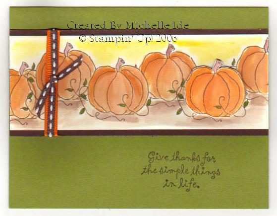 This is also for the OCOTM through Sudsol.
The pumpkin on the right has been cut out and I attached it with dimensionals.
Thanks for looking!!
This is also for the OCOTM through Sudsol.
The pumpkin on the right has been cut out and I attached it with dimensionals.
Thanks for looking!!
Subscribe to:
Posts (Atom)